

Oak & Ember Spirits
A slow, steady burn
A brand identity for Oak & Ember, where handcrafted warmth meets modern, grounded design.
02 Overview
Challenge
Design brand guidelines, bottle design, and advertisements (print and digital) for Oak & Ember Spirits’ holiday launch.
Deliverables
Brand Guidelines, Bottle Design, Advertisements (print and digital).
Objectives
Utilize Adobe Illustrator, Photoshop, and InDesign to design key components: moodboards, a logo, bottle design, advertisements, and a cohesive brand identity.
My Role
User Research & Analysis, Product Strategy, Persona Creation, Illustration/Logo Design.
03 Brand Story
Oak & Ember Spirits is the passion project of a close-knit group of friends from Tennessee, each raised in families with deep roots in agriculture and craftsmanship. After years of experimenting with various distilling and aging processes, they decided to share their craft with the world. Committed to quality and inspired by their heritage, Oak & Ember focuses on creating whiskey that embodies the warmth and complexity of oak barrels and ember-charred flavors.
Mission
At Oak & Ember, our mission is to craft exceptional spirits that reflect our roots and passion for distillation. We strive to foster a love for artisanal spirits while building connections within our community. Our goal is to create products that showcase the warmth and complexity of the aging process and to educate consumers about the art of distillation and the importance of quality ingredients.
Vision
Our vision is to become a leading brand in the craft spirits industry, recognized for our commitment to quality and innovation. We aim to inspire new trends in distillation while honoring traditional methods. Additionally, we are dedicated to promoting sustainable practices in agriculture and production, supporting local economies through partnerships and community initiatives.
04 Brand Words
Key Attributes
Craftsmanship, Authenticity, Quality.
Core Values
Integrity, Community, Excellence.
Emotions & Experiences
Warmth, Complexity, Connection.
05 Personas
Their debut product, set to launch for the holidays, reflects the essence of their rural upbringing while appealing to modern tastes. Whether targeting consumers in Middle America, Southern Country, or City Urban markets, Oak & Ember’s spirits are designed for those who appreciate craftsmanship and quality.


Middle America, Jake Thompson
Age 35 · School Teacher · Suburban Midwest

Southern Country, Sarah Reynolds
Age 40 · Small Business Owner · Rural South


City Urban, Michael Chen
Age 29 · Marketing Professional · Urban City
06 Logo
Logo Variations
The Oak & Ember logo combines rustic fonts with an illustration of a whiskey barrel to highlight the brand’s focus on craftsmanship and tradition.

Logo Colorways

07 Color
The chosen color palette reflects Oak & Ember’s connection to tradition, nature, and craftsmanship.
#333333
#9E2A2B
#694E23
#50713C
#F1E2C1
#D59B00
08 Typography
The combination of Farmhand Inline Regular, Farmhand Regular, and Beloved Script Bold reflects Oak & Ember’s blend of tradition and sophistication.
Aa
Farmhand Inline Regular
Aa
Farmhand Regular
Aa
Beloved Script Bold
09 Label Design
The label, shaped like a whiskey barrel, reflects Oak & Ember’s focus on tradition and the aging process.

10 Liquor Research
Bottle Styles
Classic round or square bottles with a vintage feel, tall slender bottles for limited editions, decanter-style bottles for special releases.
Competitors
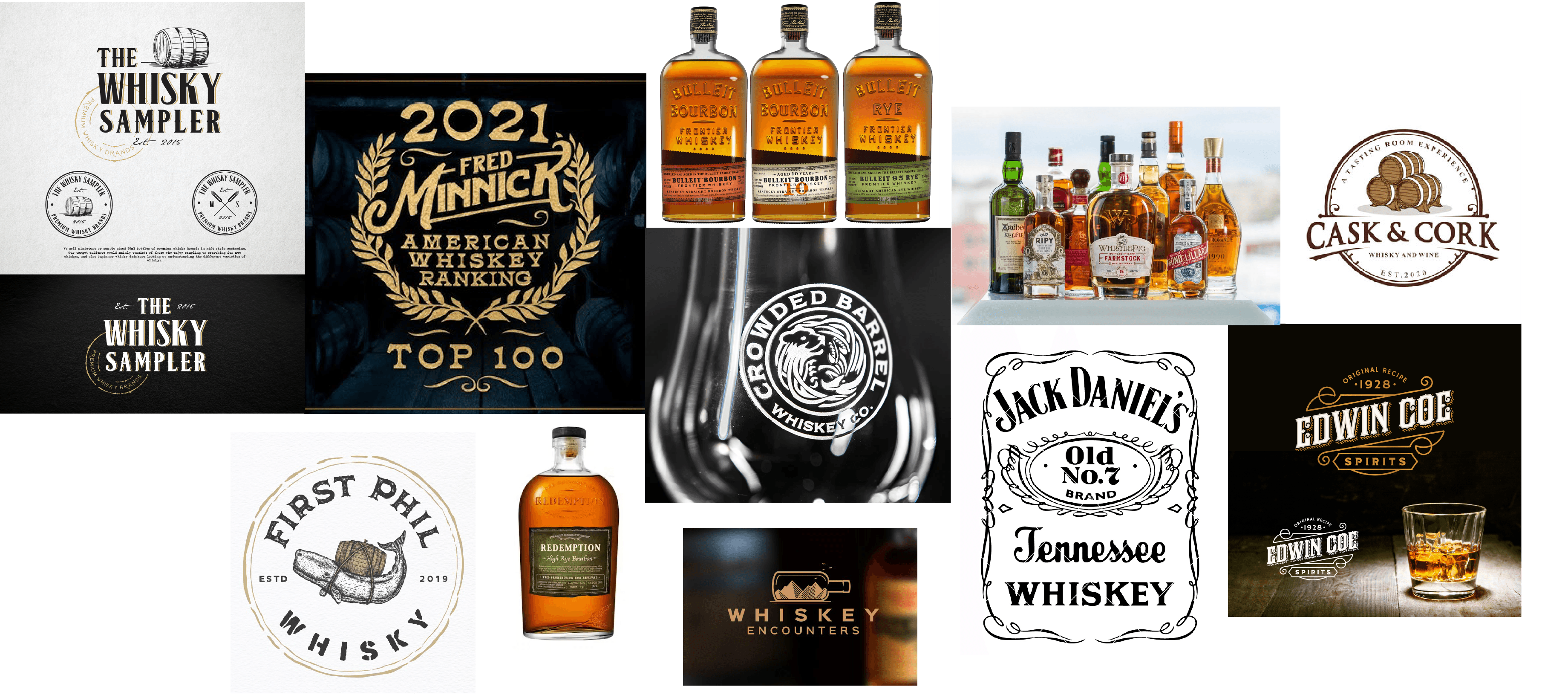
Buffalo Trace, Woodford Reserve, Bulleit Bourbon.
Label Options
Paper labels with textured finishes, embossed elements for a premium look, clear minimalistic labels with storytelling elements.
Packaging Choices
Matte or glossy finishes for the bottle, wooden boxes for special editions, eco-friendly materials for labels and packaging.
Competitive & Inspiration Moodboard
11 Pattern
Muted pastel bottle and barrel illustrations add subtle accents to Oak & Ember’s family-friendly designs.
Soft red, green, and yellow tones stand out against black backgrounds, creating a warm, vintage feel.

12 In Context
From billboards and farmers’-market signage to social media ads, the Oak & Ember identity comes to life across the real-world touchpoints its customers meet every day.
Holiday launch campaign shown across billboards, print posters, and digital placements.


Other Projects