

SS Island
Where Sweethearts Come to Play
A brand identity for SS Island, where vintage voyage meets modern island escape.
02 Overview
Challenge
Design a full brand identity for the SS Island all-inclusive party weekend, built for mature couples looking to reconnect.
Objectives
Use Illustrator, Photoshop, InDesign, and XD to design a logo, moodboards, marketing collateral, and a companion event app that bring the SS Island experience to life.
Deliverables
Brand package, print & public marketing, social media marketing, app design.
My Role
User research & analysis, persona creation, illustration/logo design, app design.
03 Brand Story
From S.O.S to SS Island, a logo built on the meeting of water and sand.
Sweethearts On Sojourn
The earliest concept, S.O.S., split a circle in two, one half calm sea, the other warm sand, symbolizing the balance between partners.
Reality Romance Inspired
Drawing from shows like Love Island and games like We’re Not Really Strangers, SS Island reimagines playful, reflective connection for mature couples.
04 Brand Words
Reconnection
A peaceful escape that lets mature couples leave stress behind and rediscover each other.
Passion
Carefully crafted activities help couples explore new dimensions of intimacy and excitement.
Mature & Playful
Tailored for couples with shared history, blending reflective games with vibrant island fun.
05 Personas
Two very different guests, one shared need: quality time together.

Jeremiah Shade, 47
Senior Finance Partner, Raleigh NC. Wants a relaxing, individualized getaway to reconnect with his partner away from work stress.

Tatiana Lopez, 28
Influencer, Los Angeles. Craves fun, adventurous nightlife and mingling with other couples.
06 Research & Inspiration
Event Attendance
40+ guests prefer relaxed daytime events with less movement; 30-and-under guests want after-hours mingling and games.
Motivations
Older couples want to spark the fire they once had; younger couples want to explore, network, and try new things.
Core Needs
Every guest shares the same need: relaxing, meaningful time with their partner, just expressed differently by age.
Competitive Landscape
Studying tropical branding like Love Island and Paradise Island helped define SS Island’s own playful, romantic visual voice.
Competitive & Inspiration Moodboard

07 Color
SS Island’s palette blends the calm of the sea with the passion of romance: soothing teal, vibrant orange, and sunny yellow.
Teal, #07A89D
Orange, #F58524
Yellow, #FFDE5C
08 Typography
Abril Fatface anchors the bold ‘SS’ mark, Copperplate lends the wordmark timeless refinement, and Cormorant Garamond Bold Italic gives the tagline a warm, inviting voice.
Aa
Abril Fatface
Aa
Copperplate
Aa
Cormorant Garamond Bold Italic
09 Logo
Logo Variations
Two mirrored S’s shaped like swans kissing symbolize love and unity, paired with Copperplate type for a timeless, refined feel.


Logo Variations


10 App Design
A companion event app keeps guests connected, from schedules and guest lists to real-time updates and love games.

11 Marketing Collateral
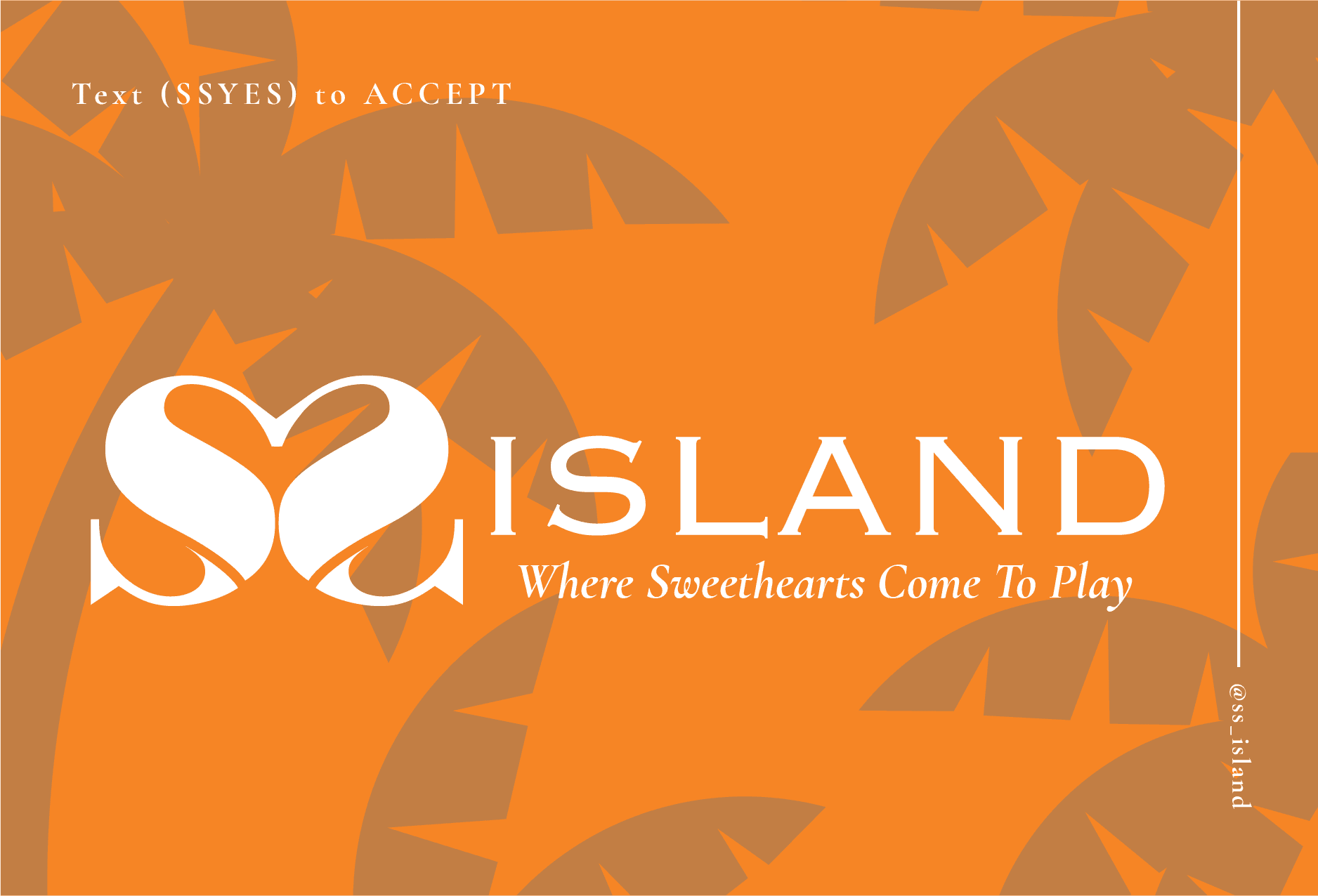
Vibrant flyers, postcards, and out-of-home ads carry SS Island’s tropical romance across every touchpoint.
From transit posters to save-the-date postcards, teal and orange accents keep the island’s warmth consistent.

12 In Context
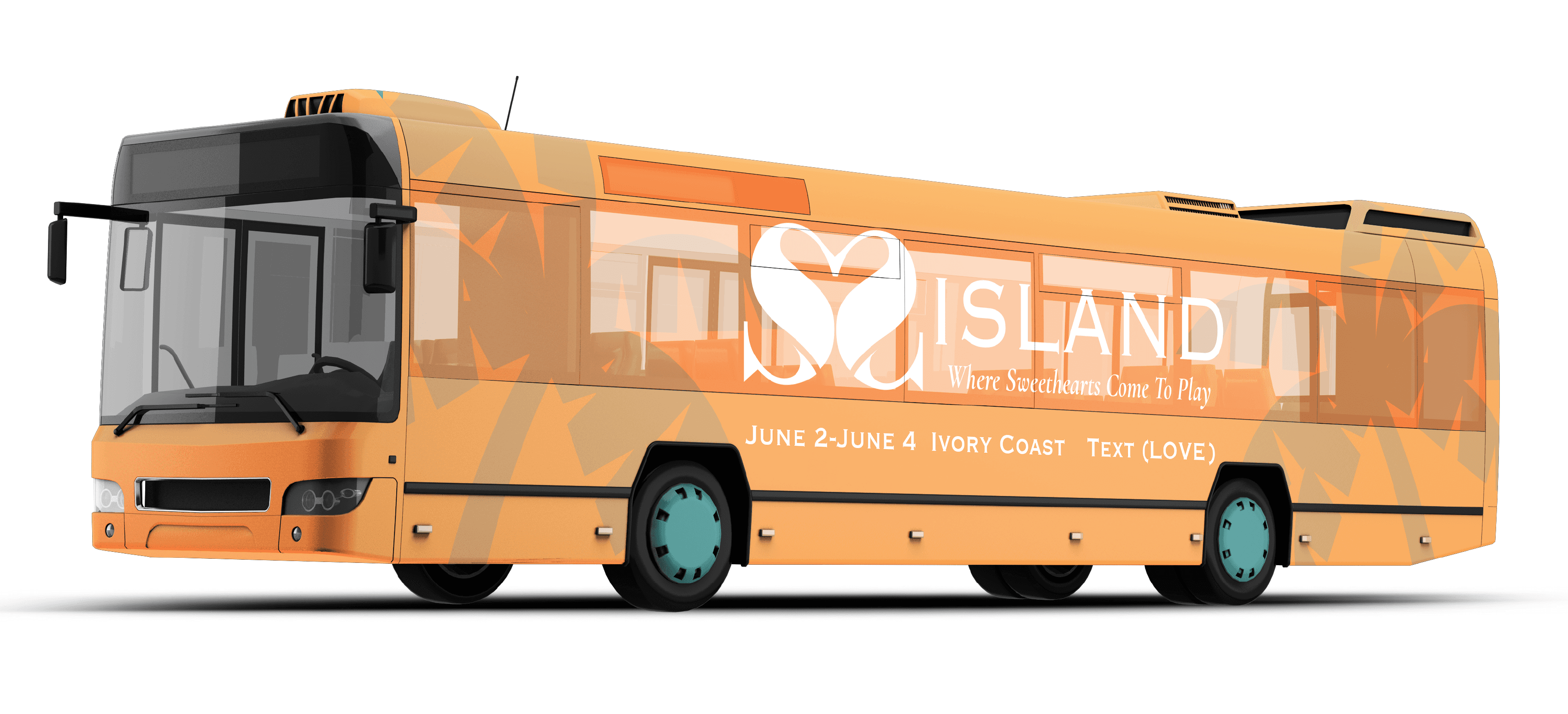
SS Island’s identity carries seamlessly from print to product to place.
From branded merchandise to transit ads, the palette stays warm and unmistakably island.



Other Projects